

Works

Mozzi — Pizza Brand Identity
Mozzi is a vibrant and playful pizza brand concept that combines bold colors, expressive typography, and a friendly tone of voice.
Designed to evoke joy and spontaneity, the identity celebrates the simple pleasure of sharing good food — with a modern twist on Italian classics.
The visual direction blends retro-inspired details with a contemporary layout, creating a warm and memorable brand experience.

Sober Magazine — Art Direction & Editorial Design
Sober Social Media — Motion & Video Edits
Sober is an independent biannual magazine and digital platform focusing on culture, art, and contemporary lifestyle.
For each issue, I developed the visual direction, layout design, and motion content, ensuring a cohesive visual identity across both print and digital formats.
The magazine’s aesthetic combines minimalist structure with expressive typography, reflecting a balance between editorial storytelling and visual experimentation.
As part of Sober Magazine’s digital presence, I created motion visuals and video edits for interviews, cover stories, and promotional content.
Each piece was designed to extend the magazine’s editorial tone into dynamic formats — blending typography, rhythm, and texture to maintain visual consistency across all platforms.
The result is a cohesive digital identity where print and motion coexist harmoniously.


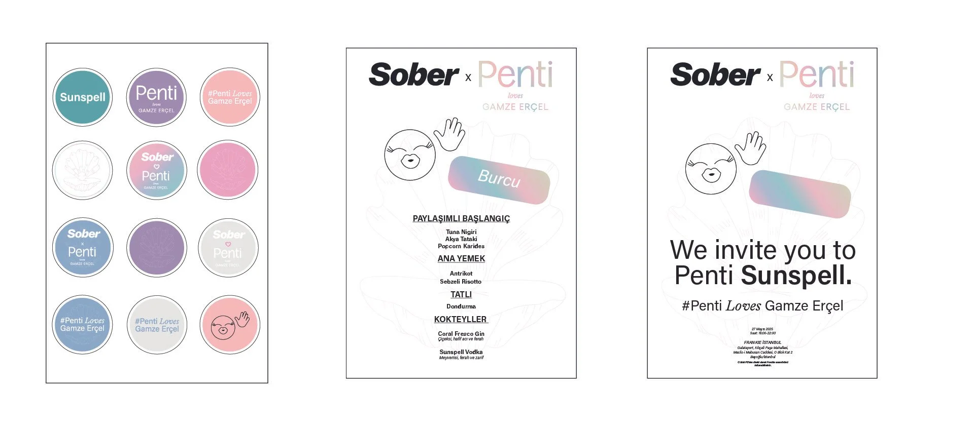
Penti Launch Event — Branding & Visual Direction
Akbank Jazz Festival — Visual Identity & Campaign Design
For Penti’s seasonal launch event, I developed the visual identity and branding materials that defined the overall look and feel of the experience.
From invitations and digital visuals to event signage and presentation assets, the design reflected Penti’s modern femininity through refined color palettes, bold typography, and tactile details.
The concept aimed to create a unified brand atmosphere — elegant, lively, and memorable.


The Akbank Jazz Festival project explores a vibrant and rhythmic visual world inspired by the spirit of contemporary jazz.
I developed the visual identity, campaign direction, and motion assets, blending organic forms, expressive typography, and dynamic compositions that echo musical improvisation.
The result is a cohesive design language that captures both the festival’s cultural depth and its modern creative energy.
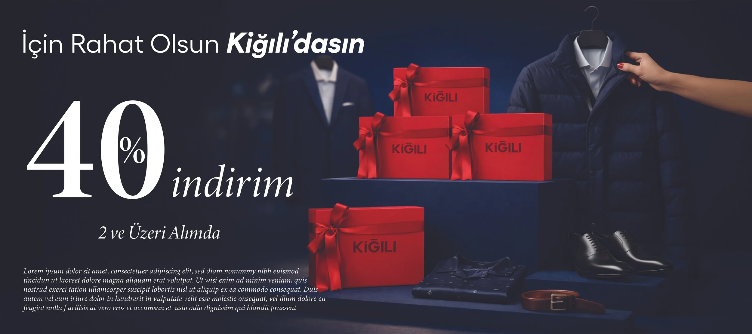
Kiğılı— Valentine’s Day Campaign Banner Design
Banner designs were created for Kiğılı’s Valentine’s Day (February 14) campaign.